- Incorrect Purchase key error
- How to update the Ultimate Addons for Visual Composer prior to version 3.16.8?
- Activate your License Key of the Ultimate Addons for WPBakery Page Builder (Formerly Visual Composer)
- Force Check Updates
- How to update plugin manually through FTP
- Update Theme or Plugin through Brainstorm Core
- Popup Form Method to Activate License Key of the Ultimate Addons for WPBakery Page Builder
- Increasing Memory Limit
- Background Image Sizes Explained
- How to hide a row on specific device?
- Not all Ultimate Addon elements are in Visual Composer list?
- If you are using a customized / skinned / modified Visual Composer
- Black bar / strip with the Video Background
- Error! Envato API error: Username and/or API Key invalid.
- Error on unzipping package
- Don’t have the “Design Options” tab in Edit Row?
- How to replicate our demo site?
- Uncaught TypeError: Cannot read property ‘left’ of undefined
- How to make the Row to cover Browser’s Full Height / Dimension / Viewport?
- Can not set links in Visual Composer?
- Video Background Not Running on Mobile Devices?
- Height of Advance Carousel Block
- Does Ultimate Addons make backend slow?
- How to reinstall & reset font icons in Ultimate Addons
- How to Trigger a Modal Popup on the Click of a Menu Element in UAVC?
- How to Set Thumbnail Image for Video?
- How to Style Play Button?
- How to Display YouTube Subscribe Bar for Video?
- How to Find YouTube Channel Name and Channel ID?
- How to fix – Multiple Google Maps API error in Ultimate Addons Maps
- How to add Row Separator?
- Guide to Setting Up Google API Key for Maps Integration for the Google Maps Elements
How to hide a row on specific device?
At times, you find some designs are not suiting well on few devices; e.g. mobile; or you may need a totally different design of a particular section when it’s viewed on smaller screens.
This can be achieved by creating totally different rows and designing elements in them differently – targeting particular screen sizes. Then – you can display only particular rows on only particular device with using any of the two ways explained as below –
- Apply CSS class to the rows + write some CSS with media queries that will display particular rows on only particular devices.
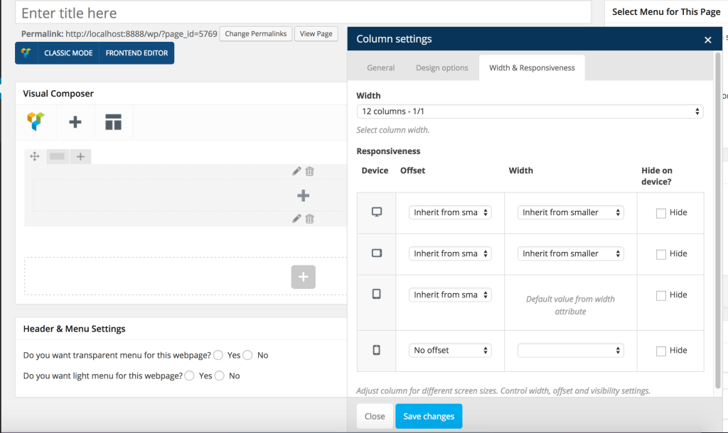
- Edit column & use Visual Composers “Width & Responsiveness” settings to hide particular columns on particular devices.

Was this doc helpful?
What went wrong?
We don't respond to the article feedback, we use it to improve our support content.
On this page
